Email Accessibility Policy
FDU works to ensure that its communications are accessible for those with disabilities. In particular, University email messages should be accessible to those who listen to them using screen reader software, view them with magnification, or use other special devices and formats.
Please review the following guidelines when preparing email messages for delivery internally or externally.
Email Content
- Include a meaningful subject line with appropriate specificity.
- Appropriately specific subject line: June 2023 Summary
- Inappropriate subject line: Monthly Summary.
- Show the sender in a From line at the top, not just as a signature block, so the recipient(s) can see who is writing without scrolling.
- Use bold for emphasis. Italics and all-caps reduce readability for all, not just those with vision issues.
- Use underline always and only to indicate hyperlinked text.
- Avoid using tables unless you have the proper tools to create them in accessible form.
- Only use a table when presenting data in a table format; do not use tables for layout or decorative purposes.
- If using a table, test your message to ensure that the rightmost columns can be viewed on mobile devices.
- Avoid attachments when possible unless you have the proper tools to create them in accessible form.
- Consider including the content of the attachment in the body of the email instead.
- See links to Microsoft resources in For More Information below.
- Avoid animations and embedded video unless you have the proper tools to create them in accessible form.
- Link text should clearly indicate the destination
- Appropriate link text: “For transfer students”
- Inappropriate link text: “Click Here”
- If a link destination is other than a web page, the link text should so indicate:
- Appropriate link texts: “For transfer students [PDF],” “Download the Transfer Student PDF Application,” “Watch a Video on FDU”
- If the length of the document warrants it, use distinctly formatted headings (not just bold paragraphs) to break up the text.
Email Layout
- Use black text on a white background to eliminate issues with contrast or colorblindness.
- Use a familiar sans serif font such as Arial or Calibri.
- All text should be 12pt or larger.
- Format the message as a single column of paragraphs, aligned at the left margin. Centered or justified text may break up when the message is forwarded.
- Use your email client’s bulleted/numbered lists feature when creating lists, rather than inserting a bullet/number manually in front of list items.
Images in Email
- Important information should appear in body text, not in an image. It is only appropriate to include text in an image when:
- The text is part of a logo
- Presenting the text in a particular font or design context adds significant meaning to the email, and the image contains no more than a few words of text (such as the main heading of the email).
- Provide concise alternative text (alt text) for each image explaining its content for visually impaired individuals and those who have blocked image display for privacy reasons. Repeat any text that appears in the image. View instructions on how to add alt text in Outlook.
- If the image is relevant to a prominent hyperlink in the text, make the image a clickable link.
- If your images are wider than 320 pixels, make sure they will be recognizable when they are reduced to fit on a mobile device screen.
For More Information
Microsoft’s recommendations on accessible emails
Microsoft’s accessibility checker for Word, Excel, and Powerpoint
Examples


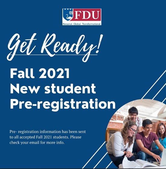
Fall 2021 New Student Pre-registration
Pre-registration information has been sent to all accepted Fall 2021 students. Please check your email for more information.